Duration
July – September 2022
Type
Independent student project completed while in the BrainStation UX program
Responsibilities
User research, personas, information architecture, user flows, sketches, wireframing, prototyping

Problem
Recent studies have shown that there is a high demand but a shortage of volunteers. People that want to volunteer don’t know where to look for opportunities, and people that found the opportunities are often turn-off by the complicated application process.
Solution
Today’s people are accustomed to using mobile apps for quick and easy access to look up all the information they need. The goal is to create a mobile volunteer app with easy-to-use tools to search and apply for opportunities and to communicate with organizations, which will connect more people with their local community.
Understanding the User
Before beginning the design process, I needed some additional context. My primary focus was to figure out some of the different ways people search and apply for volunteer opportunities and what challenges they may face. I decided it was best to conduct interviews with both sides of the party and learn from people with different levels of volunteer experience as well as the volunteer program operators.
Research Findings
Both volunteers and organizations have very unique needs and challenges so an app with two front-facing sides is needed:
Volunteers Side
- Search, filter, and save opportunities
- Learn opportunity detail and organization background
- Submit required documents
- Apply to the opportunity
Organization Side
- Post customized opportunities
- Collect and review applications
- Organize and vet candidates
- Book interviews and video calls
Key Insights
Here are a few insights based on the information gathered in my interviews:
- People don’t know where to look for volunteer opportunities other than just searching online
- People have busy lives and value their time, so application processes that have too many steps involved would lead to a high drop-off rate
- People want to be efficient and complete as many tasks using as few tools as possible

Competitor Research
To learn a little bit more about the market, I observed and analyzed several competitors and noted some of the features they were offering their users. In particular, I studied Indeed and Volunteer Vancouver, two successful digital products in the job site and volunteering field.
- Indeed offers a dedicated app with features tailored toward job seekers and employers
- Volunteer Vancouver offers powerful search functionality for finding opportunities
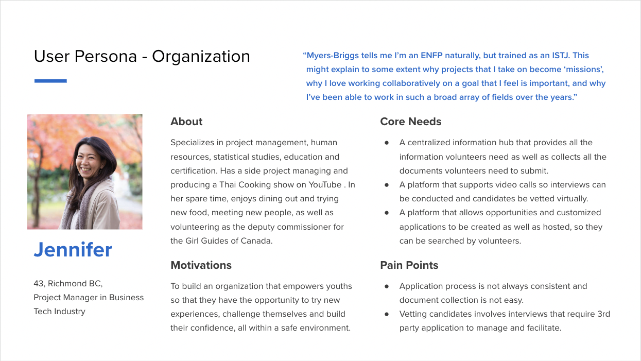
Personas
After gathering and organizing my findings, I needed to create two personas to visualize the target end-users. To guide me through the design process, I wanted to ensure that these two personas accurately portrayed a volunteer eager to apply for opportunities as well as an organization operator actively recruiting the perfect volunteer candidates.
These personas were referred to throughout the entire product life cycle in order to remain focused when making design decisions.

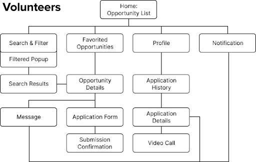
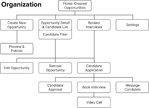
Information Architecture
Afterward, I went to work on ideating information architecture from the perspective of the volunteers and organization operators. This allows me to know what users will be expecting to accomplish with the apps. The information architecture shows the structure of the app and the relationships between different pages.
User Flow
The information architecture provided me the foundation to build user stories and flows. These show me how users will be navigating the app action by action. With the limited time constraint I had to work on this project, I chose to focus on one specific task flow for each of the two user groups: searching for opportunities for volunteers and reviewing and approving candidates for organization operators.


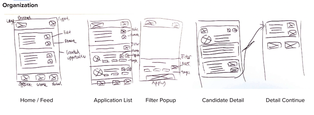
Sketches
I started with several basic sketches of how I wanted the overall layout to be structured to begin the design stage. I wanted the user to select between recommended opportunities and search results and access their account settings all from the homepage. This was reflected in the sketches shown below.

Wireframes
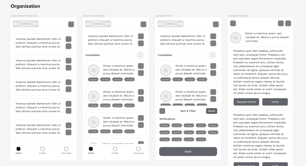
Once the final sketch layout was completed, it was time to incorporate those ideas into wireframes. To help visualize how the app should be structured, I created low-fidelity wireframes for the main pages in Figma.
Low-Fidelity Prototypes
Now that the structure of the application was determined, I moved on to creating a low-fidelity prototype. This was useful when determining how enjoyable and functional the current design was during this stage.

User Testing
As always, I conducted user testing with several participants before finalizing my designs with high-fidelity mockups. After gathering various insights from users, the following changes were made:
- Improves colour contrast and ensures text size for the best legibility and accessibility
- Improves consistency of button layout and placement to optimize the user experience and avoid errors

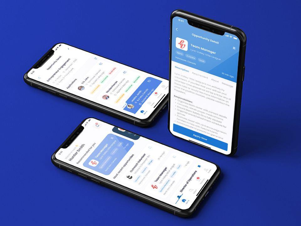
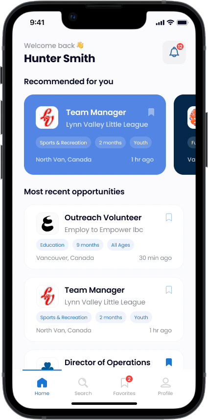
Final Design – Clickable Prototype
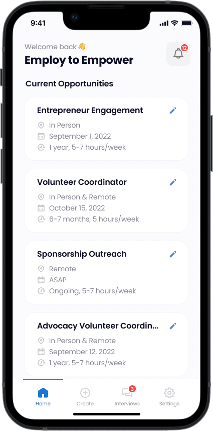
The purpose of this application was to allow eager volunteers to quickly search, filter and learn about various opportunities available, as well as to allow organization operators to easily navigate, learn and approve possible candidates. With this in mind, I wanted the app to have a clean, consistent, and minimal feel to ensure the design doesn’t get in the way of the user’s goals.
The final high-fidelity prototypes can be tested below, click on a screen to start experiencing the app on the volunteer-facing or organization-facing side. Feel free to press F on your keyboard or click the maximize icon in the top right of the frame below to enter full-screen mode. You can also press R to reset the user flow.
Volunteer Facing Side
Organization Facing Side
Takeaways & Next Steps
With this project, I learned about the different ways volunteers and operators digest information and what challenges they frequently encounter. While this application may not solve all the problems, the goal was to provide a simpler experience where eager volunteers can easily find opportunities and communicate with organizations, connecting people with their local community.
All test users have enjoyed the prototype and have expressed interest in seeing the full application. When it comes to further improving and developing this experience, some next steps would be:
- expand and refine the overall application flow for volunteers
- design a flow for organizations to create an opportunity
- implement a flow for account creation and account details
- design the communications aspect where volunteer candidates can connect with organization operators
