Winja888 Branding
Client: PayPerHead
Year: 2019
Agency: Hamazaki Wong Marketing Group
Role
Art & Visual Direction
Naming & Branding
Design & Production Lead
Production Planning
Scripting and Storyboarding
Video Direction & Producing
Post Production
Website Planning & Development
PayPerHead, a bookmaking service provider, was expanding its international market and the first step was launching a subsidiary focusing on Chinese bookies.

The ask was to develop a brand to successfully reach the Chinese market, including naming, logo design, brand guidelines, website, digital banners and social media marketing materials, and branded instructional videos. The brand needed to work effectively for Chinese bookies as well as to keep English bookies interested.
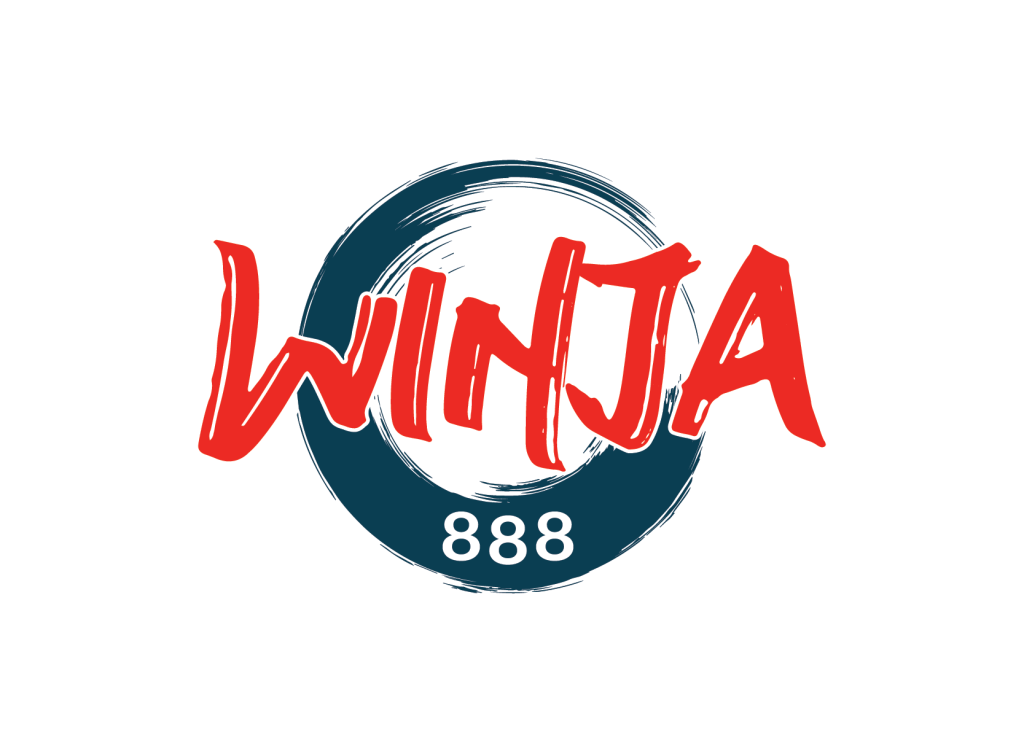
The name Winja888 was a combination of three words/terms: Win, Ninja, and 888. ‘Win’ is direct and bold, ‘Ninja’ brings a sense of action and excitement, and ‘888’ is an extremely lucky number that is well-liked by the Chinese community. The pronunciation of ‘Winja’ sounds really similar to the word “Winner” in Mandarin and is a key aspect for going with ‘Winja’, and ‘888’ was added in the end to complete the name.

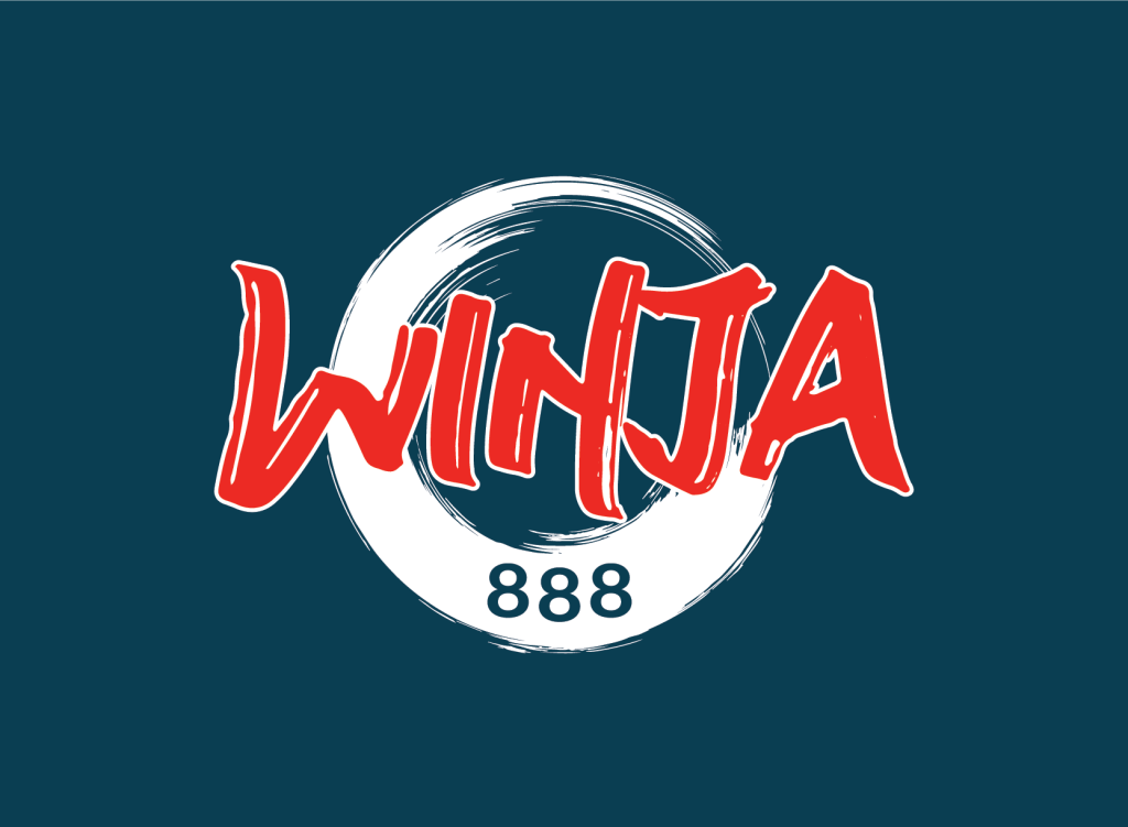
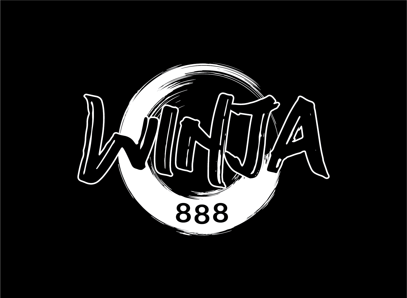
The logo was inspired by a calligraphy brush stroke that has a strong Chinese cultural vibe. The strokes were crafted to be easily legible Different pressure strokes were used to show movements, where the stroke starts and where it ends. A circular stroke was introduced to contain the wordmark ‘Winja’ as well as to house ‘888’, and it was placed behind the wordmark to add a sense of depth. Bright orange and navy blue colour combinations were chosen as these contrasting colours emphasized movement and motion. Also, this combination is used in the sporting world frequently, which is very fitting for the brand.

Caligraphy strokes and contrasting colours were the key elements used throughout all the marketing materials on various platforms to keep the brand visuals consistent. Cartoon character mascot and minimalistic line-art icons were created and action-oriented images were used to aid the overall visual and tone of the brand.

Three instructional videos were created from the ground up starting from content planning, storyboarding, visual style planning, talent scouting, video production scouting, video shoot directing, and post-production. The timeline and budget were extremely tight, but my team and I pulled it off and the process was fun.
This was a well-received project and it really showcased how a bi-cultural approach can be used used to successfully bridge the Chinese and English-speaking consumers/clients.
